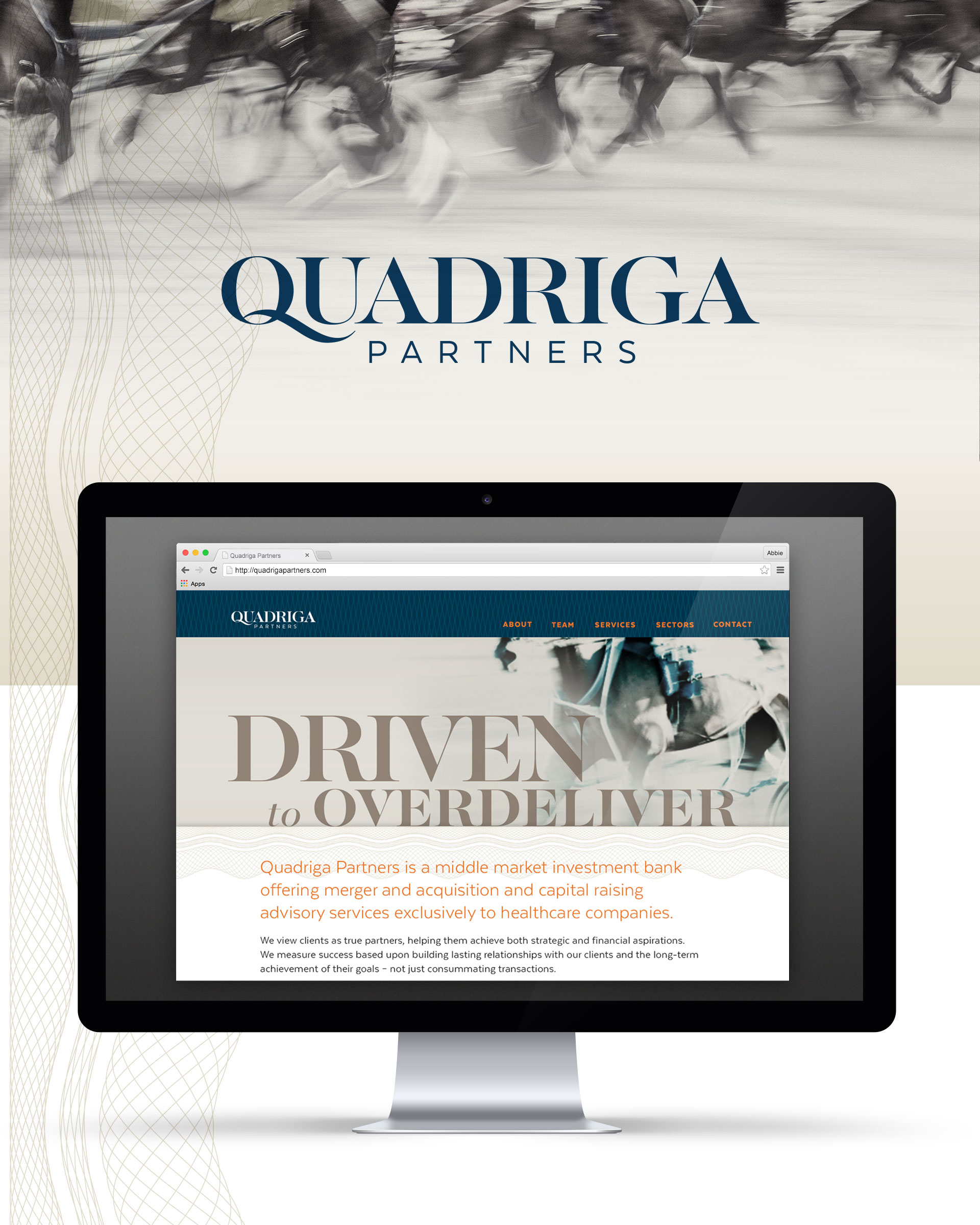
As a fast-growing boutique investment banking firm, Quadriga Partners needed to differentiate themselves as a bold and trustworthy long-term partner, focused on their client’s best interest.
As a fast-growing healthcare investment banking firm, Quadriga Partners needed to evolve their brand to differentiate themselves from a staid competitive landscape to better connect with their audience and inspire their internal team. Quadriga Partners harnesses their boutique perspective to fight for their client’s best interest building investment strategies founded on lasting client relationships rather than single successful transactions.
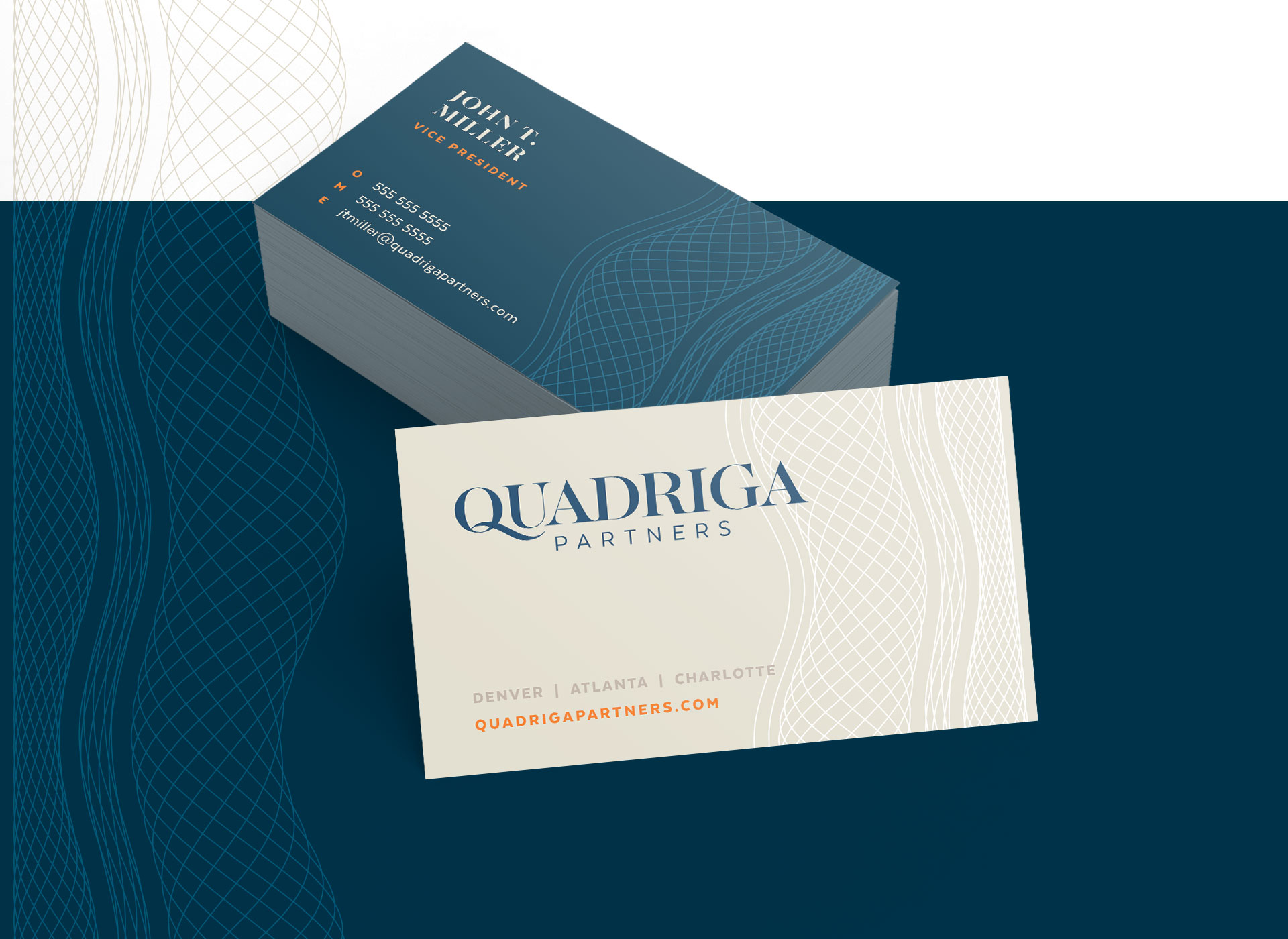
A trustworthy color palette, currency-inspired type and patterns, and imagery that nods to the horse-driven Quadriga – a symbol of the firm’s founding partnership – creates a boldly sophisticated and trustworthy impression that sets this firm apart.
Project completed at D+i Creative.
Creative direction: Ben Gust
Art direction + design: Abbie Goetting
Copywriting: Abbie Goetting
Project management: Megan Amendola


